Overall
I am very pleased with the outcome of this assignment. I feel that it does bring together a great many things that I have learnt studying this module. I do not think that I would or could have produced this material before these studies.
Technical and Visual
Black and White – I chose monochrome for the presentation of these images for two reasons. Firstly, the assignment is about a link to the past, but as it is seen today. I felt that the monochrome choice heightened the linkage to the past. I do accept that given the assignment was about the present day, it could have been colour but I felt the backwards looking linkage was more important. My second reason was from my study of Baltz’s Candlestick Point (Candlestick Point – Lewis Baltz, n.d.). In this collection Baltz has collated one series in colour and the other in monochrome. I felt that the monochrome images caused me to study them harder and I wanted the same effect here.
Video – I have chosen to make the main presentation of this assignment a video. To achieve this I had to learn new techniques in Adobe Premiere Pro. In particular I had to learn transitions, audio overlays and text effects. Whilst this is a photography module and not a video one, I do feel that the skills are a new facet to my publishing skills and do open up the possibility of presenting my work in news ways that I did not know how to do previously.
Capturing Technique (Frame Size) – I shot my images with my camera set to a 5:4 ratio which has become my default framing choice for landscape photography. Earlier in this course I experimented with square format but found this to be too cramped, whereas the default 3:2 format I found too wide. And so I have settled on 5:4. Originally I was capturing in 3:2 and cropping later but often found that I would mis-capture the images and so now I capture in my intended size and accept that this means losing the very edges of the same if I wanted to use them later.
Capturing Technique (Exposure) – Earlier in the course I had experimented with bracketing exposures and in many of my shots for this assignment there were strong lighting contrasts in the scene that meant this could have been useful. I chose instead to make use of camera histogram, shoot in raw, and capture as much information in the scene as possible in one shot.
Resolution – I have learnt about video production resolution and its impact when it comes to online distribution. The higher the resolution the higher the file size and I had not anticipated the challenges that this would create when using on my blog. In the end I have published a 1080p version for use within the blog and have shared a link for a much higher resolution version that would be used in a professional presentation. I used Adobe Media Encoder to produce these different versions which is another new skill for me. The learning point is the need to consider not just the choice of presentation, ie video, but also how I intend to distribute that video and therefore what choices need to be made as part of that process.
Quality of Outcome
I am very pleased with the quality of the individual images and of the video I have produced.
It is clear that my images are inspired by the New Topographics which are known for their technical excellence. I feel that my images stand up to scrutiny in that context. Although my main intended presentation of my images is through a video where intense scrutiny is less easy, my images could also be displayed as physical prints and I am pleased with their quality.
In terms of the output living up to my artist statement. I found that my statement served as a useful guide when I was creating my images for this assignment, but then when I was producing the actual assignment itself, I decided to update the statement. This was partly because I felt that it was not focussed enough but also I wanted to include the statement within my video and the length of time that this needed to be on the screen when in its long form was too long. Hence I developed a new statement.
I feel that my images do live up to the intent of the old and the new artist statement. What I also found that by having the statement, I was more able to leave my images open to interpretation. I did not need to label or order the images according to their category of restored, falling down or incorporated into new buildings. I think this improves the quality of the outcome. The images are more polysemic, they require the viewer to engage with each image and consider how it relates back to the options within the artist statement, this is a new experience for me.
I think that the presentation of the images in a video also enhances the quality of the outcome. The video forces a pace for the viewer and ensures that they will move through the images in the order that I intended. The addition of the soundtrack I feel helps to heighten the ‘feeling’ of the mills, almost like the sounds are also an echo of the past.
Demonstration of Creativity
I think the output of my assignment, in video form, demonstrates considerable creativity.
In particular the bringing together of images and a soundtrack to create a video has created something that I think has quite an effect on the viewer.
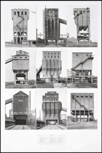
In terms of the images themselves, when I had been visualising this assignment before starting, I had thought that I would adopt a typography approach to capuring each mill, aiming to show just the mill and to capture them all the same, perhaps similar to Becher’s approach with Coal Bunkers shown in the figure below.
However, whilst I was capturing the images, I came to realise that much of what I wanted to capture was the surrounding land and so I stood back and framed all of my shots a little differently. The creative aspect of this capturing process was to capture not just the building but to isolate exactly the parts of the surroundings that I wanted to but without capturing too much and without destroying some sense of commonality between the images. I think that I achieved this.
I am particularly pleased with the way in which I have left space for the viewer to draw their own conclusions as this is something I have previously struggled with. In an earlier exercise, when I produced the book, I ordered my images so that there were sections for each of the categories of Preservation, Destruction and incorporation. At the time I felt that this worked, however this is my usual trait of trying to be too prescriptive. With the introduction of an artist statement, I have set that scene already, the viewer knows that these categories exist and there is no longer any need for me to signpost the images. For the video, I placed them in a random order and then moved a few around as I felt the flow was not quite right. What is produced leaves space for the viewer and I am happy.
Context
The biggest influences on my work are those of the New Topographics and in particular my research for Assignment 4 into Lewis Baltz and his collection Candlestick Point.
It is Baltz’s portrayal of the landscape in his series Candlestick Point (Candlestick Point – Lewis Baltz, n.d.). that led me to capture the mills using the framing that I have. When discussing his images he spoke of wanting to leave a sweep, a space for the viewer (Heiferman, 2010) and this is what I have chosen to do here.
I have also, like Baltz, chosen to capture the majority of my images without people, wherever possible also without cars. Whilst some shots do show people, Mill #4 for example, they are very small in the scene and do not distract the viewer. Baltz said “I’ve thought that when people appear in a picture, they are automatically perceived as the subject … I wanted the only person in the picture to be the viewer” (ibid.). I wanted the same effect and believe that I have achieved the same.
My images although varied are in the main deadpan and do not follow the painterly tradition. I have used a range of different framing approaches to introduce variety, an approach I saw when studying Justin Partyka who uses this as a regular approach in his artwork (Partyka, n.d.).
Lastly, I was also reminded of Paul Reas and his series Flogging a Dead Horse (Reas, 1993). Although my images are nothing like his, the purpose of his series was to highlight the exploitation of an industrial past to create a modern day tourism business. I see strong parallels between the irony he was highlighting in his images, and in the title of his series, and those between what I see as the cynical use of the names of mills to make modern developments appear less intrusive.
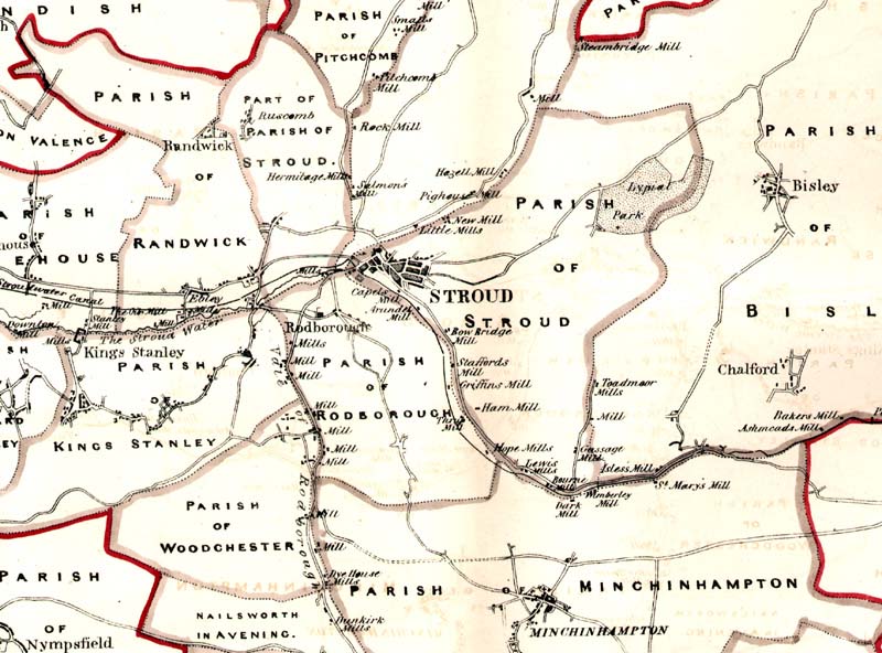
For the content, I was inspired by the mills themselves and my research into their history, I found significant material available online. This is largely document in my report for Exercise 3.5 (Wilkinson, 2022). Of particular note is the way in which the history is described by Baggs, Juice and Shells (Baggs, Jurica and Sheils, 1976) and the map that made me realise just how significant this industry was to Stroud, shown below in Fig. 2. The learning here is that projects such as this can take their inspiration from history not just beautiful or sublime views and also to remember not to limit my research purely to photography, there is more to research than just past imagery.
Bibliography
Steidl Verlag. n.d. Candlestick Point – Lewis Baltz. [online] Available at: <https://steidl.de/Books/Candlestick-Point-0913274354.html> [Accessed 17 January 2022].
Heiferman, M., 2010. Lewis Baltz in Conversation with Marvin Heiferman. Art In America, January 2010, p.100.
Partyka, J., n.d. Home. [online] Justinpartyka.com. Available at: <http://justinpartyka.com> [Accessed 18 October 2020].
Reas, P., 1993. Flogging a Dead Horse — Paul Reas Photographer. [online] Paul Reas Photographer. Available at: <https://www.paulreas.com/portfolio-1/project-two-pa8ag> [Accessed 21 March 2021]
Wilkinson, A., 2022. Exercise 3.5 Local History. [Blog] LPE Learning Log, Available at: <https://landscape.tonys-view.com/exercise-3-5-local-history/> [Accessed 21 March 2022].
A P Baggs, A R J Jurica and W J Sheils, ‘Stroud: Economic history’, in A History of the County of Gloucester: Volume 11, Bisley and Longtree Hundreds, ed. N M Herbert and R B Pugh (London, 1976), pp. 119-132. British History Onlinehttp://www.british-history.ac.uk/vch/glos/vol11/pp119-132 [accessed 20 April 2021].
Figures
Figure 1. Becher, B. and Becher, H., 1965. Coal Bunkers. [image] Available at: <https://www.tate.org.uk/art/artworks/bernd-becher-and-hilla-becher-coal-bunkers-t01923> [Accessed 6 February 2022].
Figure 2. 1830. Dawson’s Map of Stroud. [image] Available at: <https://www.digitalstroud.co.uk/working-cloth>[Accessed 20 April 2021].